Understanding Jetpack Compose

Jetpack Compose
Jetpack compose simplifies the app development process and speeds it up. With Jetpack Compose, you can write less code compared to the current view building approach – which also means fewer potential bugs. It uses Kotlin.
Why Jetpack Compose?
Jetpack Compose makes it easier to write and maintain your app UI by providing a declarative API that allows you to render your app UI without imperatively mutating frontend views. One of the biggest differences in writing the UI code with Jetpack Compose is that it won’t use the traditional Views of Android and instead there are Composables for all the View
Composable:
Layouts on Jetpack Compose are built upon Composable methods, which are annotated with Composable annotation and need to have a unique name in the project. The easiest way to organize the UI is using Columns and Rows. Both of these contain a parameter called ‘children’ where other Composables places inside the Parent Composable. Composables are meant to be used is along with Preview and Preview is another annotation that should be used on the Composables. In this case, when a Composable is a Preview, the layout will the rendered on the Design View.
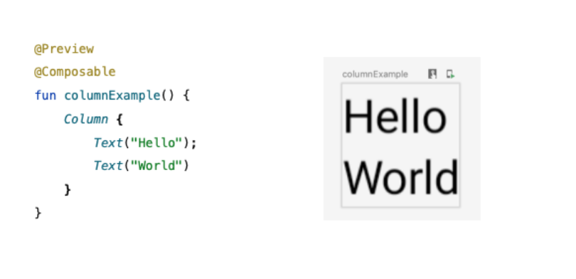
This Composable, MainLayout, is used on setContent() of an Activity to render TextViews.

Modifiers
Another change is the addition of modifiers that allows defining standard UI properties for the Composables as margins, background, padding, clickListeners, etc. Other examples of Composables are: ‘Scaffold’ (basic Material Design parent), ‘TextField ‘(EditText), ‘Image’ (ImageView), ‘LazyColumnItems’ (RecyclerView).
Jetpack Compose Layout types:
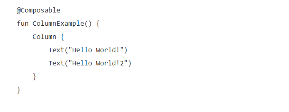
Column: A Column will show each child below the previous children. It’s similar to a LinearLayout with vertical orientation.
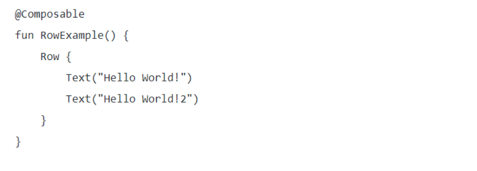
Row: A Row will show each child next to the previous children. It’s similar to a LinearLayout with a horizontal orientation.
Constraint layout: A ConstraintLayout in Compose is similar to a ConstraintLayout from the classic Android View System
A ConstraintLayout requires a ConstraintSet as a parameter. In the ConstraintSet, declare all constraints of the layout. Children will set the children of the layout.
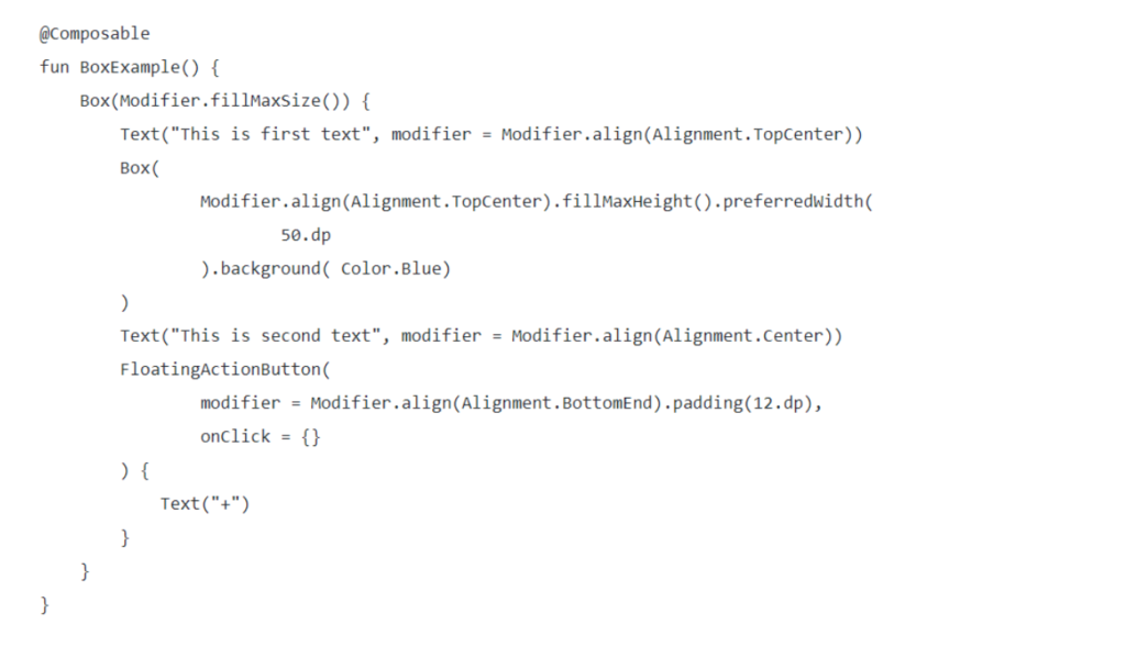
Box: The children of the Box layout will be stacked over each other. You can use the gravity modifier to specify where to draw the composable.
Jetpack compose Features:
Interoperable: Compose is interoperable with your existing app. You can embed compose UIs within Views or Views within Compose. You can add as little as a single button to a screen, or keep that custom view you’ve created in a now Compose screen.
Jetpack Integration: Compose integrates with the Jetpack libraries you already know. With integration with Navigation, Paging, LiveData (or Flow/RxJava), ViewModel, and Hilt, Compose works with your existing architecture.
Material: Compose offers an implementation of Material Design components and themes, making it easy to build beautiful apps that reflect your brand. The Material theming system is easier to understand and trace, without having to consult multiple XML files.
Lists: Compose’s Lazy components offer a simple, succinct but powerful way to efficiently display lists of data, with minimal boilerplate.
Animation: Compose’s simple and coherent animation APIs make it far easier to delight your app’s users.
Compose Preview: Compose preview available in Android Studio Arctic Fox allows you to see your Composables in different states, light and dark theme, or different font scalings, all at the same time, making component development easier, without having to deploy a whole app to your device. Enhanced with live editing of literals, you can see updates without recompiling your project.
For more information, you can take a look at basics Codelab and Learn-Jetpack-Compose-By-Example.
All about Jetpack Compose : https://developer.android.com/courses/pathways/compose


